Aesthetics with a system.
Basic principle
Copy link to this element
Link Copied
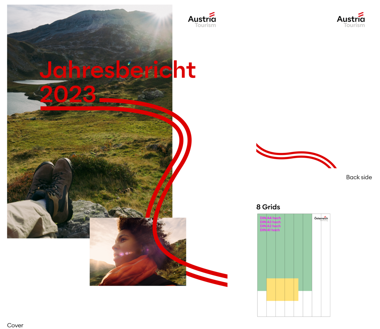
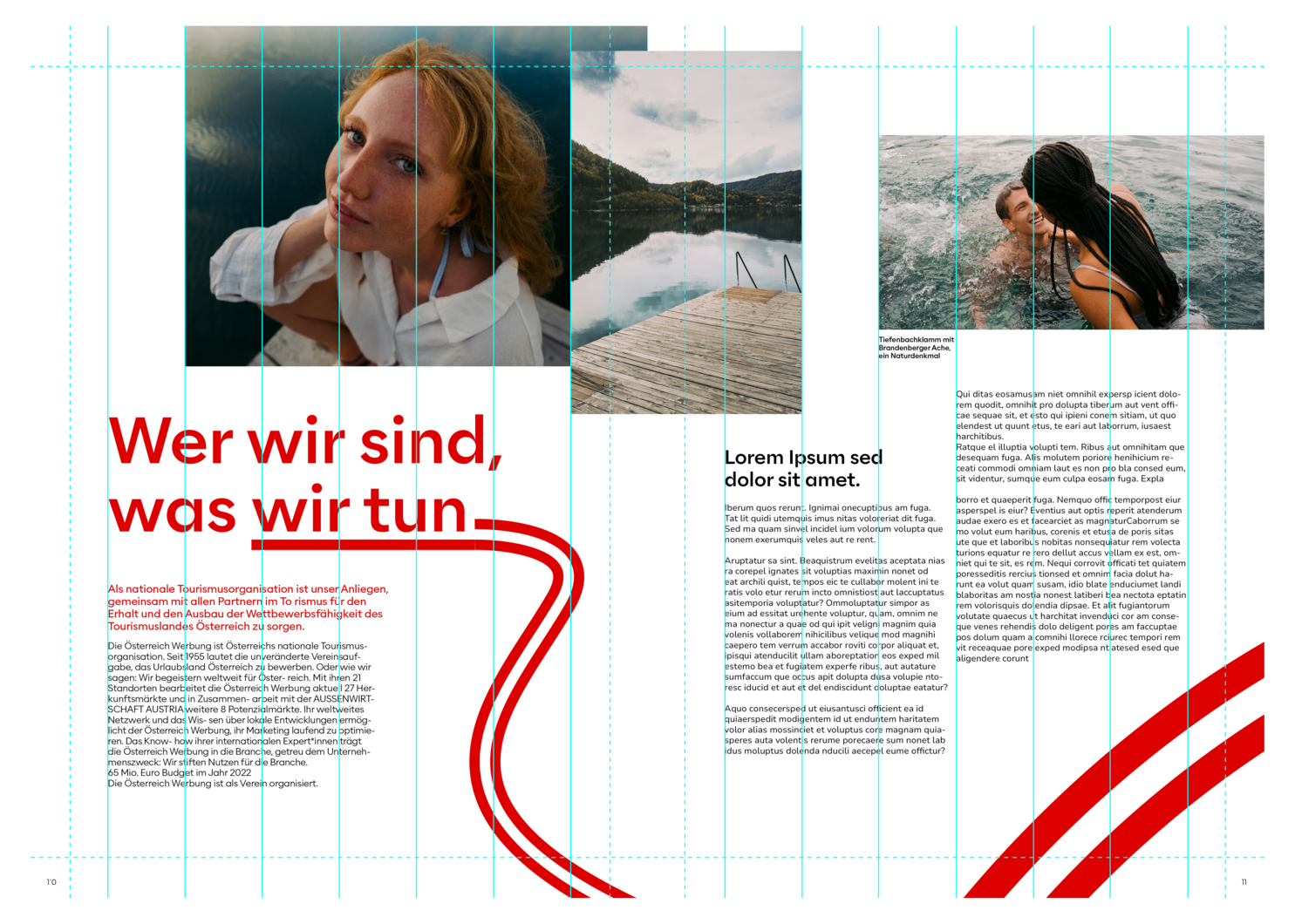
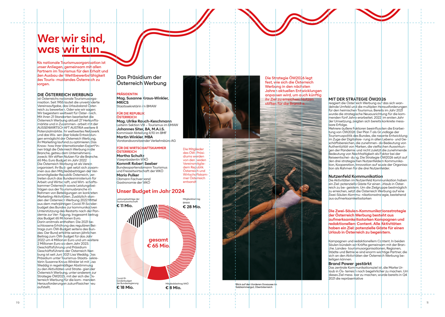
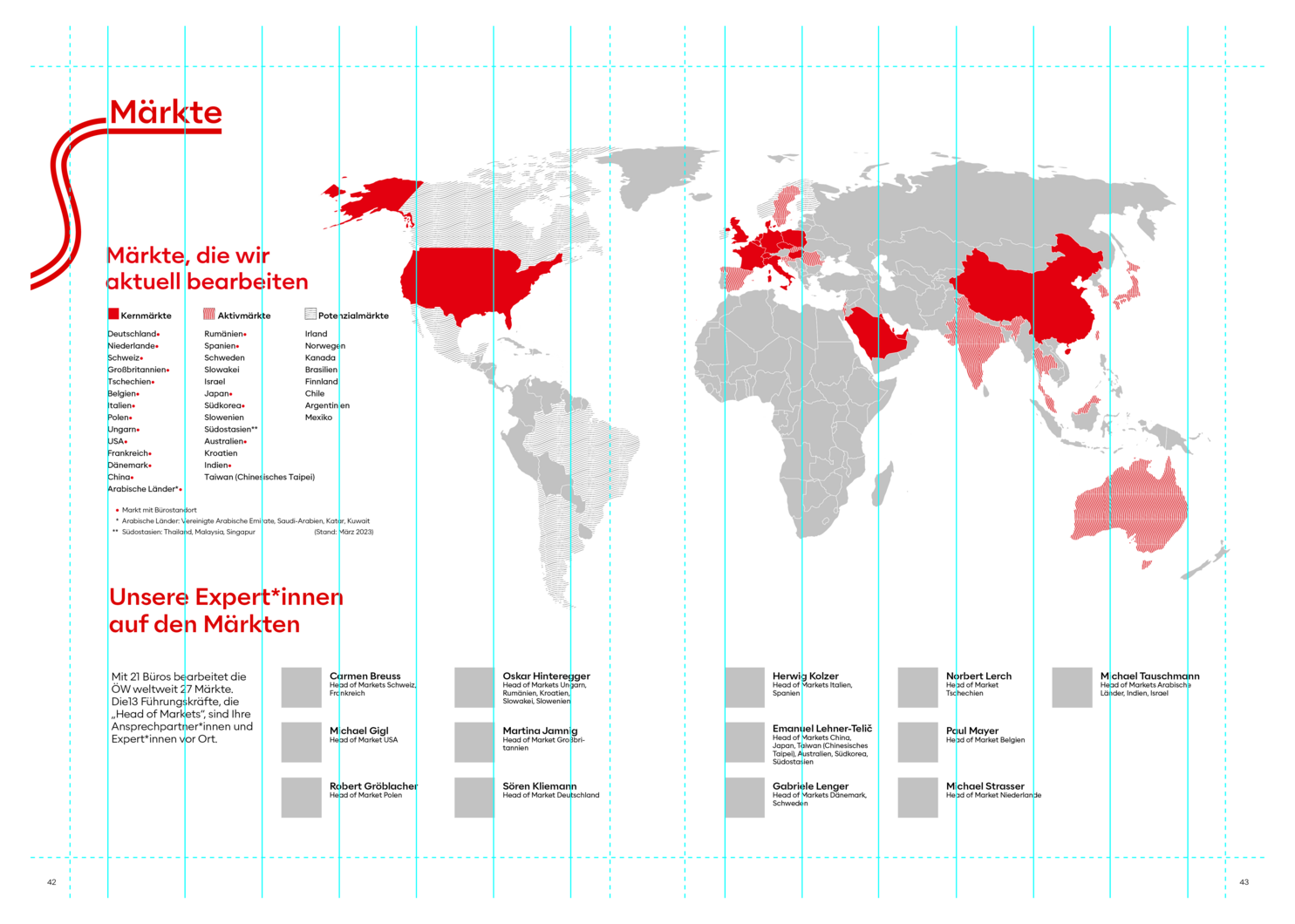
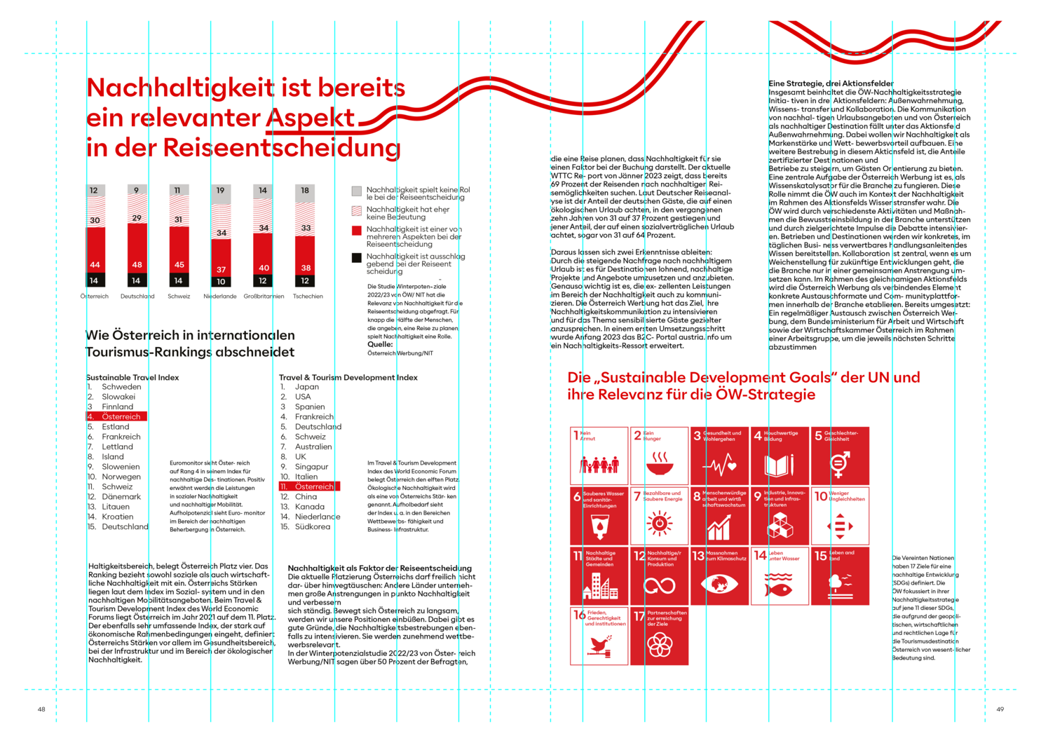
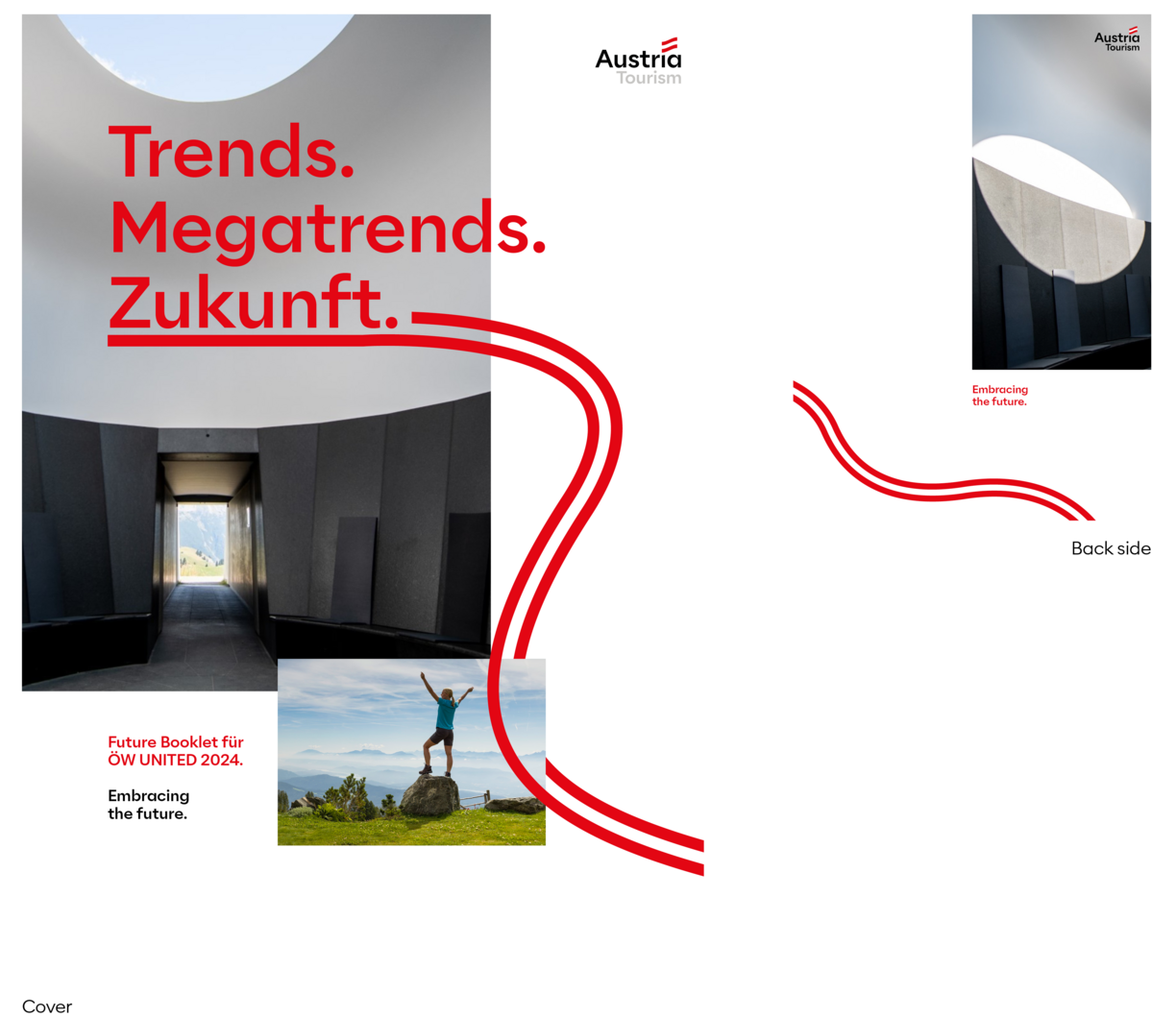
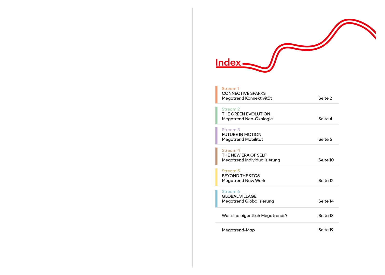
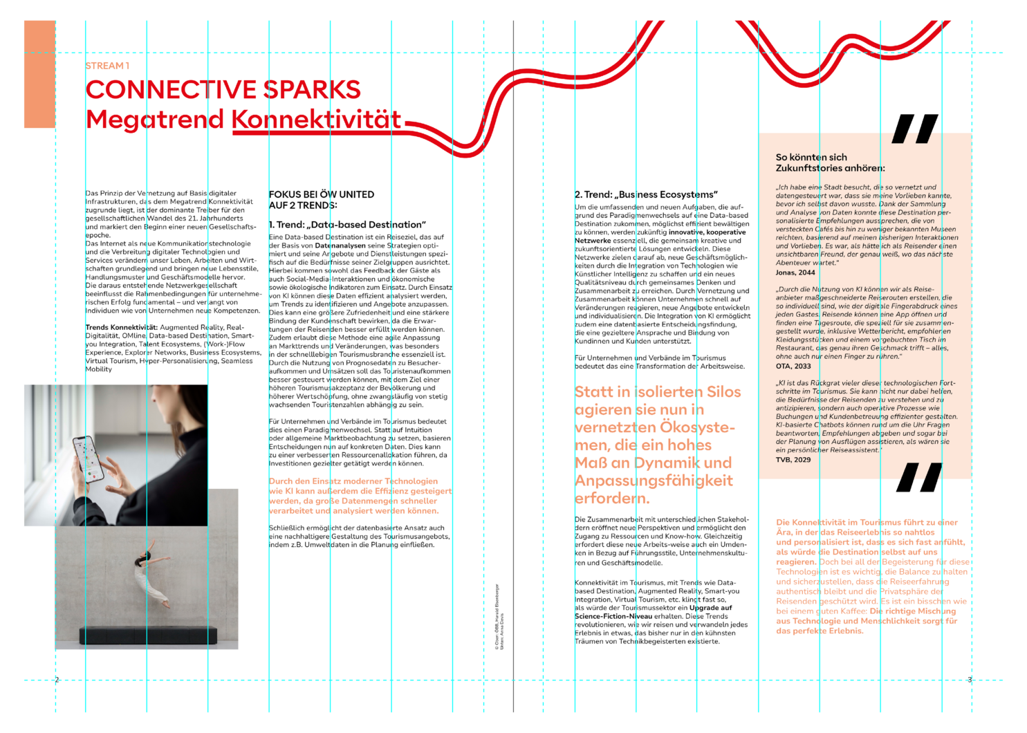
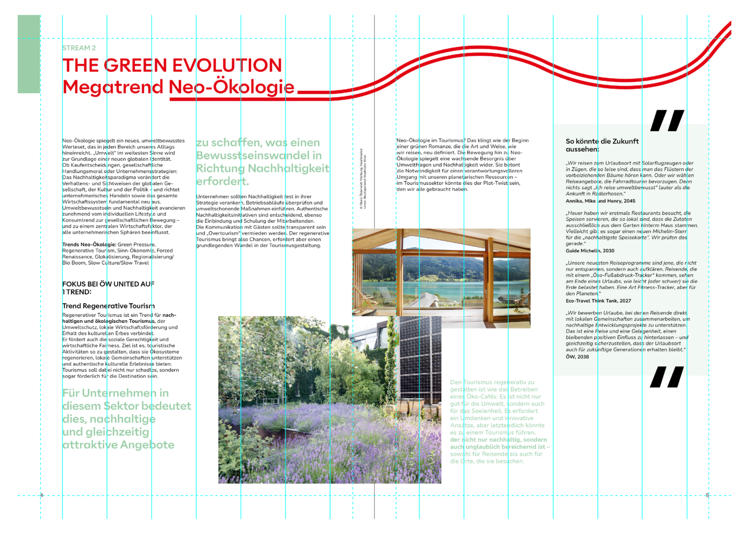
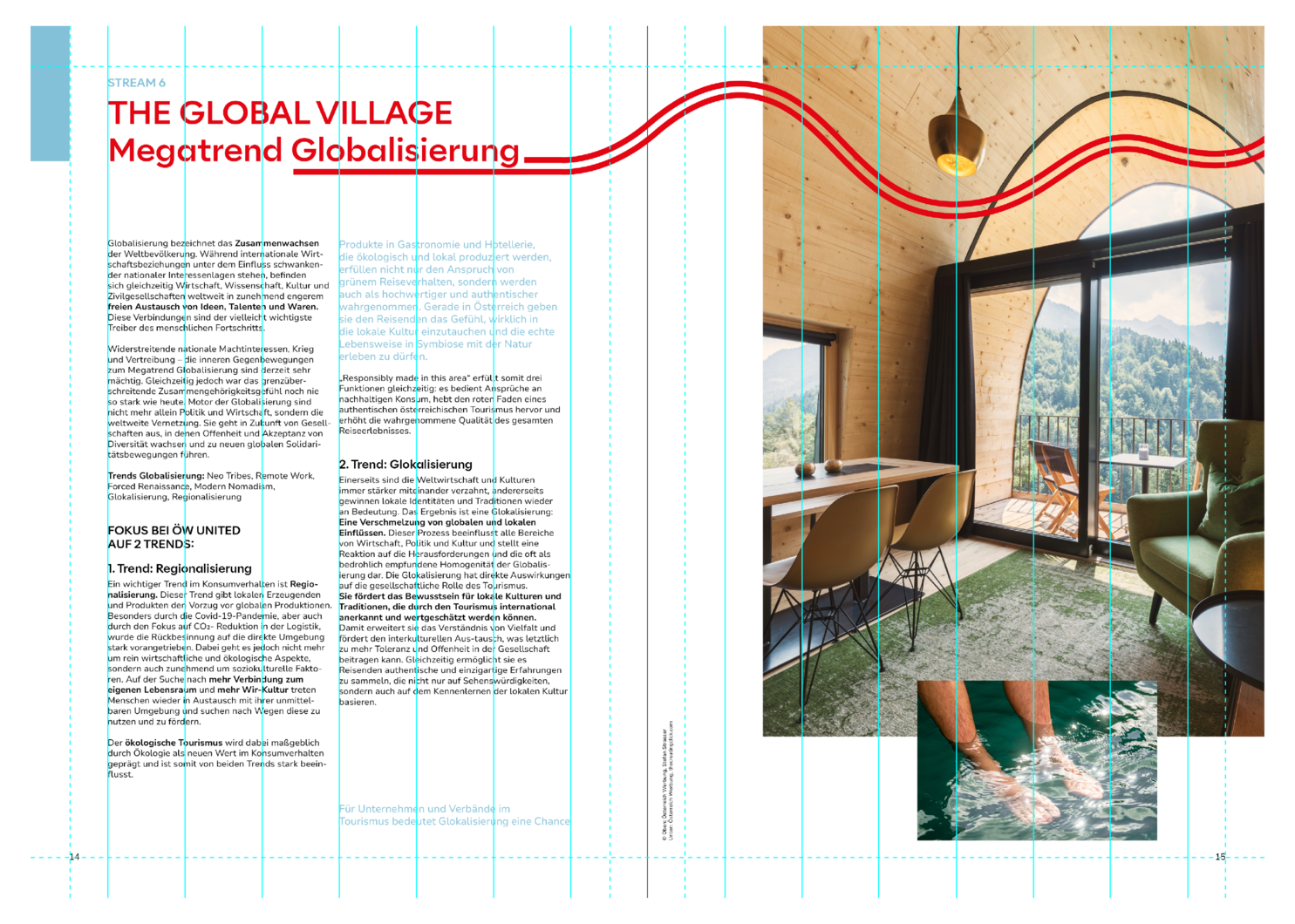
In general, the design of advertising media across all channels is made up of essential standard elements: Visually, an emotional image is paired with an image that localises this specific feeling. In the text, the headline combination reflects the visual impressions. The vibe acts as a connecting element; the logo and URL round off the perfect brand presence.
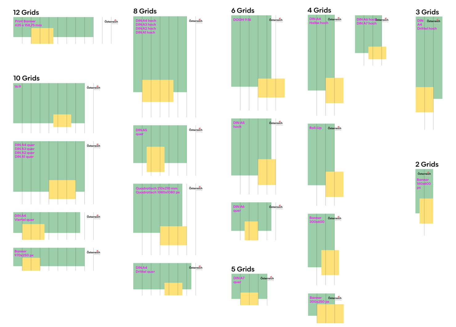
For layouts, the master templates have to be referred to.
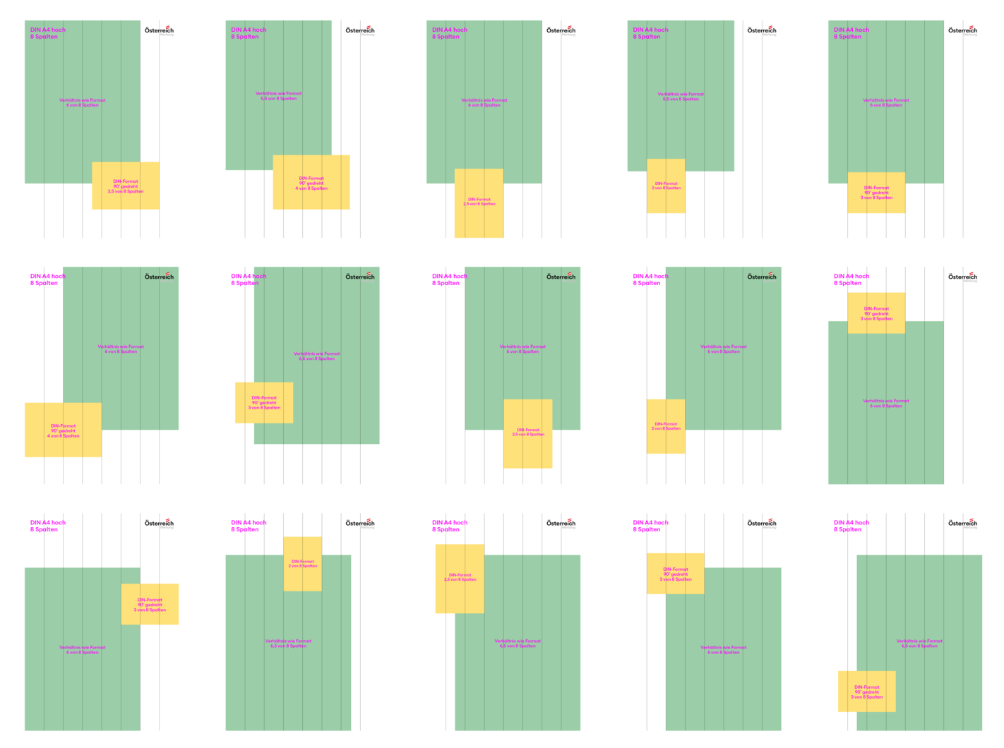
Most master templates consist of 4 versions that provide an overview of the various options. However, the arrangement can and should vary. Different arrangements convey a desired liveliness and lightness that support our “Lebensgefühl“ brand essence. The vibe can be just as lively.
The positioning of the large image should always be chosen according to the image content. This is to avoid that in combination with the centred Lebensgefühl lettering no important content is lost.
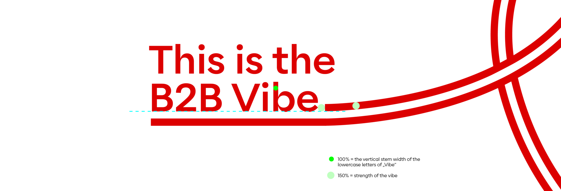
Our vibe symbolises a journey, a moment, a feeling. In the B2C sector, we know neither the beginning nor the end of the vibe. Because we are on a journey.
And we realise: This journey begins in the B2B area
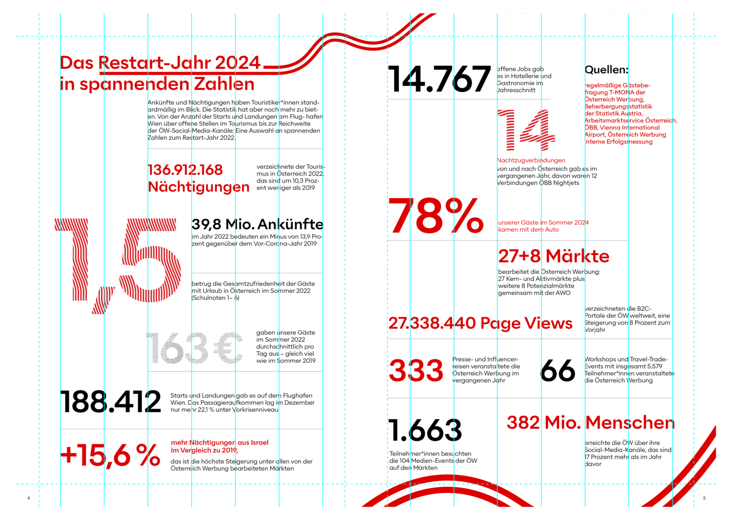
The vibe is available in various designs and should be matched to the subject wherever possible.
